The Designer is an easy to use tool that allows you to design your own product. You can select a product to decorate with stock art, your own designs or photos and text.
To change the currently selected product:
- Click on the Change Product button in the Product panel.

The Select Product popup will be displayed.
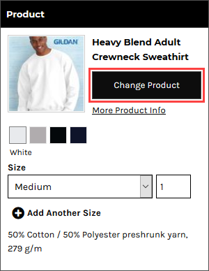
- Click on a product to select it.
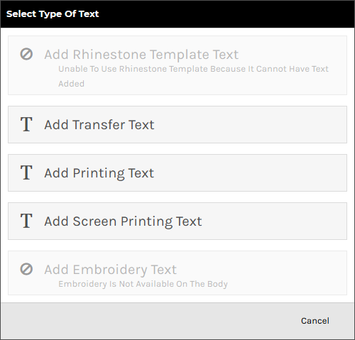
To add text to a product:
- Click on the Add Text button in the Designer Toolbar.

- Select the type of process to be used for the text in the Select Type of Text popup. Only options that are supported by the product being decorated will appear.
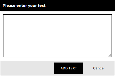
- Enter the text, and click ADD TEXT.
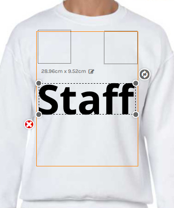
The text will appear inside the decoration area in its bounding box with editable size dimension, resize and rotate handles and delete control available.
To adjust text properties:
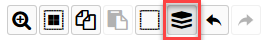
- Click on the View and organize layers button in the View Toolbar.
- Click the text object you wish to adjust the properties of.
The Text Properties panel will appear on the left side of the Designer.
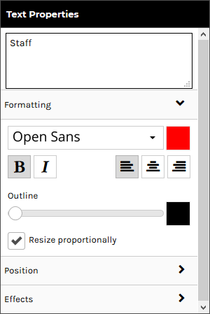
- Configure the text as required:
- Text Box: lets you edit the text.
Formatting
The Formatting tab is expanded by default and contains the following controls:
- Font: change the font via the Select A Font popup.
- Font color: change the text color via the color popup.
- Bold: boldens the text.
- Italics: italicizes the text.
- Left-align: aligns text to the left when it spans multiple lines.
- Center-align: center-aligns text when it spans multiple lines.
- Right-align: aligns text to the right when it spans multiple lines
- Outline: lets you apply an outline to the text. At the leftmost position on the slider, no outline is applied. Moving the slider to the right applies an outline that increases in thickness the further right it is moved.
- Outline Color: lets you set the color of the outline via the color popup.
- Resize Proportionally: when this checkbox is ticked, the text will keep its original proportions when you resize it.
Position
Effects are only available for the direct to garment printing decoration process.
Click on the Position tab to expand it. Expanding the Position tab reveals the following controls:
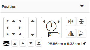
- Position controls: lets you move the selected text within the decoration area using any of the eight directional arrows.
- Size controls: lets you increase/decrease the size of the selected text by clicking on the up/down arrows.
- Rotation controls: lets you turn the selected text around its center axis. You can do this by:
- Specifying a specific angle at which to rotate the text.
- Clicking on the left arrow to rotate the text 5 degrees to the left.
- Clicking on the right arrow to rotate the text 5 degrees to the right.
- Horizontal Centering controls: Horizontally centers the selected text within the decoration area.
- Vertical Centering controls: Vertically centers the selected text within the decoration area.
- Layering controls: lets you change the layer at which the selected text is positioned in relation to other decorations.
Effects
Click on the Effects tab to expand it. Expanding the Effects tab reveals the following text effects:
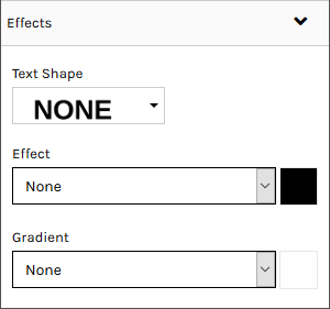
- Text Shape: lets you alter the shape of the text. The options indicate the shape that they will apply.
- Effect: lets you add a shadow or glow effect to the text.
- None: no effect is applied.
- Shadow: applies a drop shadow to the text.
- Offset: lets you set the position that the shadow will be offset from the text.
- Blur: lets you set the level of blurring effect that will be applied to the shadow.
- Glow: applies the appearance of a glow around the text.
- Strength: lets you set the intensity of the glow.
- Blur: lets you set the level of blurring effect that will be applied to the glow.
- Effect Color: lets you set the color of the Effect via the color popup.
- Gradient: sets a horizontal or vertical gradient of color between the selected font color and the gradient color.
- Gradient Color: lets you set the color of the Gradient via the color popup.
To add a design using the Add Design button:
- Click on the Add Design button in the Designer Toolbar.

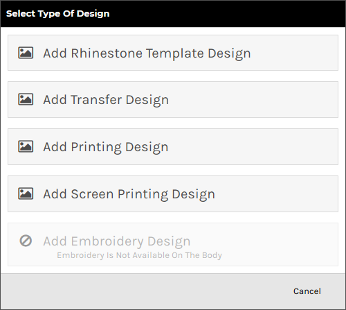
- Select the type of process to be used for the design in the Select Type of Design popup. Only options that are supported by the product being decorated will be enabled.
- Browse to and click on the design you want to add in the Select a design popup.

You can select designs from the following sources:
- Upload a new design: Click on Upload Image to upload a design from your device.
Raster, vector, and embroidery file types are supported in the formats as listed below:
- Raster (PNG, JPG, JPEG, GIF, TIF)
- Vector (CDR*, PDF, EPS, PS, SVG, SVGZ)
- Embroidery (EMB)
Vector based graphics will have modifiable elements such as text and colors editable on the fly by users.
*CDR requires the CorelDRAW app to be enabled. When a CDR file is uploaded it will be automatically converted to SVG format so that it can be modified in the Online Designer.
- Your own previously uploaded design designs: These will appear under the Upload Image button if you have uploaded designs before.
- Instagram: Click on the Instagram button and enter your credentials to access your Instagram pictures.
- Facebook: Click on the Facebook button and enter your credentials to access your Facebook pictures.
- Store Designs: designs exclusive to the store.
- Stock Designs: Third-party designs available for use in DecoNetwork.
- Upload a new design: Click on Upload Image to upload a design from your device.
- Click SELECT DESIGN.
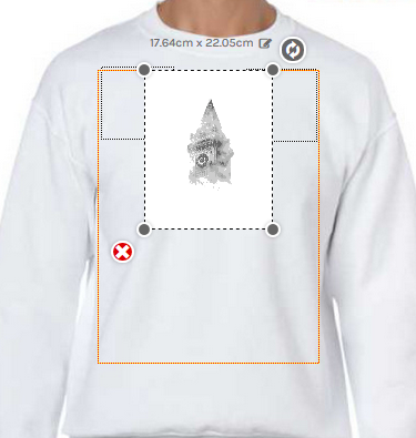
The design will appear inside the decoration area in its bounding box with editable size dimension, resize and rotate handles and delete control available.
To add a design by drag and drop:
- Drag a design file from your computer into the decoration area of the product in the Designer.
The decoration area will be highlighted when the mouse pointer is within its boundaries.
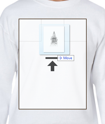
- Release the mouse button to drop the design into the decoration area.
The Select Type of Design popup will be displayed with the supported decoration types enabled for the product selected.
- Select the decoration process you want to be used for the design.
The system will begin uploading the design file to your own design library.

- Tick the, I hereby declare I own the rights to print this image, checkbox in the Confirm Copyright Permission popup to verify that you have permission to use the design.
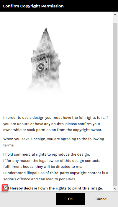
- Click OK.
The design will appear inside the decoration area in its bounding box with editable size dimension, resize and rotate handles and delete control available.
To adjust design properties:
- Click on the View and organize layers button in the View Toolbar.
- Click the design object you wish to adjust the properties of.
The Image Properties panel will appear on the left side of the Designer.
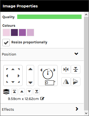
- Configure the design as required:
- Quality: Shows you a bar indicating how clear the image is for printing. The indicator reflects how well the raster-based graphic is going to print before blurring too badly. If this drops below a certain threshold, the system will warn the customer that their print quality will be compromised.
This option is only available for raster designs.
- Colors: Shows you the colors currently used in the design.
- edit: Click on the link to edit the design colors.
This option is not available for designs that have restrictions on customizing.
- Resize Proportionally: when this checkbox is ticked, the design will keep its original proportions when you resize it.
This option is not available for embroidery, transfer and rhinestone designs.
- Ungroup: click on the link to ungroup the design into its component elements.
This option is only available vector-based designs.
Position
Click on the Position tab to expand it. Expanding the Position tab reveals the following controls:
- Position controls: lets you move the selected text within the decoration area using any of the eight directional arrows.
- Size controls: lets you increase/decrease the size of the selected text by clicking on the up/down arrows.
- Rotation controls: lets you turn the selected text around its center axis. You can do this by:
- Specifying a specific angle at which to rotate the text.
- Clicking on the left arrow to rotate the text 5 degrees to the left.
- Clicking on the right arrow to rotate the text 5 degrees to the right.
- Horizontal Centering controls: Horizontally centers the selected text within the decoration area.
- Vertical Centering controls: Vertically centers the selected text within the decoration area.
- Layering controls: lets you change the layer at which the selected text is positioned in relation to other decorations.
Effects
Click on the Effects tab to expand it. Expanding the Effects tab reveals the following controls:
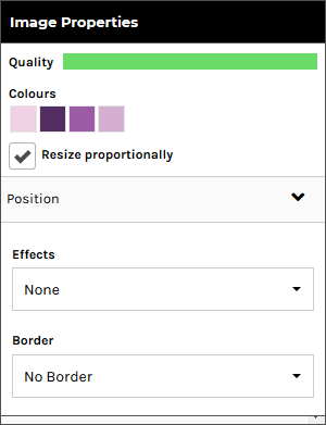
These options are only available for raster designs.
- Effects: lets you apply a special effect to the design that alters its appearance. Click on the Effects drop-down box to see the effects options.
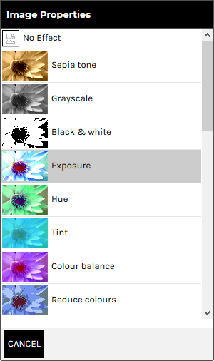
Click CANCEL to return to the Effects Panel.
- Border: lets you apply a border to the boundary of the design. Click on the Borders drop-down box to see the border options.
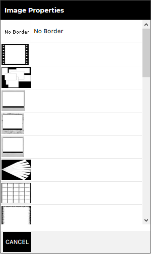
Click CANCEL to return to the Borders Panel.
- Quality: Shows you a bar indicating how clear the image is for printing. The indicator reflects how well the raster-based graphic is going to print before blurring too badly. If this drops below a certain threshold, the system will warn the customer that their print quality will be compromised.
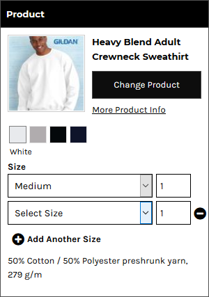
To specify product sizes and quantities:
- Click on the Product button in the Designer Toolbar.
The Product panel is displayed.

- Select a size from the Size drop-down list and specify the quantity required in the input box for that size.
- Click Add Another Size to specify quantities for each size required.
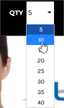
To specify product size and quantity when products are sold in bulk:
- Click on the Product button in the Designer Toolbar.

The Product panel is displayed.

The Quantity field will show the minimum quantity you can purchase.
Note, you can not select multiple sizes when products are sold in bulk.
- Select a size from the Size drop-down list in the Product Panel.

- Select a quantity from the QTY drop-down list in the Designer Toolbar.
To arrange design layers:
- Click on the View and organize layers button in the View Toolbar.
The Layers panel is displayed showing all the text and design objects present in the decoration area.
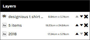
- Arrange the elements as required:
- To move a layer up, click on the up arrow to move it to a new position in the list. Likewise, to move a layer down, click on the down to move it to a new position in the list.
- To delete a layer, click the cross icon at the right of the layer.
To re-group template design elements:
You can group elements from a template design that you have ungrouped.
- Click on the View and organize layers button in the View Toolbar.
The Layers panel is displayed showing all the text and design objects present in the decoration area.

- Hold down the Ctrl key and click on each layer you want to be grouped.
- Click on the Group Selected Items button in the View Toolbar.
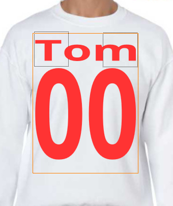
To add team names:
"Team name" allows automatic formatting of text in the form of a small name and large number beneath, decorated onto the product. This is useful for teams and other groups who would like a jersey-style name and number on their product.
- Click on the Add Team name button in the Designer Toolbar.

- Select the decoration process you want to be used for the team names.
The Add Team name popup will be displayed.

- Select a size and specify the quantity required for that size.
- Click Add Another Size to specify quantities for each size required.
- Click Next.
The Edit Team name popup will be displayed containing Name and Number fields to match the quantities specified in the Add Team name popup.
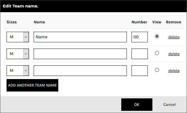
- Configure team names by entering the team name and number for each product to be decorated.
The item selected in the View column will be the item that is displayed in the Designer.
- Click Add Another Team Member and specify the team name and number for each additional product required.
- Click OK when done.
The team name and number will be set up on the product as text areas whose properties may be adjusted as per normal text, except that any changes made will apply to all team name products.
See the section, To adjust the properties of text in the Designer, above, for details on how to adjust the formatting, adjust the position and apply effects to the text fields.
- If you want to edit the teamnames and numbers, select a text area and click Edit teamnames in the Text Properties panel to display the Edit Team name popup.